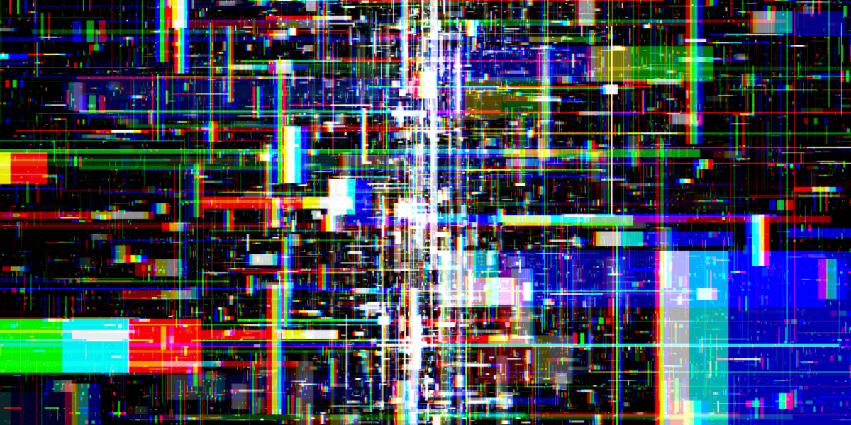
Glitches Disrupt Standardized Expectations
Modern design often prioritizes uniformity. Clean layouts, smooth transitions, and responsive elements form the basis of what’s considered “professional.” But glitch-based design intentionally disrupts these expectations. Instead of removing errors, it highlights them.
In a digital campaign, a design team might introduce warped fonts, misaligned elements, or image artifacts on purpose. The result isn’t random. It sends a signal that the project isn’t meant to blend in. The glitch breaks the visual flow, forcing users to slow down and reconsider what they’re seeing.
Imperfection Creates Authenticity
Perfect design can feel distant or overly manufactured. Glitch design introduces flaws that remind viewers of human presence behind the screen. These design choices don’t follow a fixed grid or predictable path. They allow space for emotional reaction and interpretation.
A brand updating its online identity may choose textures, noise, or visual instability instead of sleek graphics. This shift builds trust—not because it’s clean, but because it’s real. It shows that control isn’t the goal. Connection is.
Design Systems Benefit From Tension
Glitch design adds friction. It introduces tension between form and function. This tension challenges users to navigate unpredictability with awareness. Rather than scanning mindlessly, they engage with the content.
During a product launch, the interface might deliberately pause, stutter, or rearrange itself mid-scroll. The disruption feels unexpected, but it has purpose. It trains the audience to look more carefully. This interaction deepens impact and reshapes the user’s role—from observer to participant.
Error-Inspired Aesthetics Shift Power
When a glitch becomes part of the design, the balance of control shifts. Traditional UX design assumes a user wants ease. Glitch design asks the user to question that assumption. It offers less convenience but more depth.
In a campaign promoting open access or creative freedom, the use of glitch breaks traditional marketing structures. The audience navigates the site with uncertainty, not out of confusion but out of curiosity. This shift repositions power—from system to viewer.
Flaws Can Anchor Visual Memory
Designs with imperfections tend to be more memorable. The mind registers them differently. While polished content may look good, flawed visuals stick. They interrupt expectation, which creates stronger recall.
A designer working on an awareness project may distort text, animate broken patterns, or flash unexpected transitions. These elements become part of the message. They’re not mistakes—they’re anchors. When a viewer remembers the glitch, they remember the idea behind it.
Glitch Design Reflects Digital Reality
No system is perfect. Servers crash. Pages lag. Code breaks. Glitch design reflects that truth instead of hiding it. In doing so, it mirrors real digital life—messy, reactive, and unstable.
For a developer launching a public archive, designing for imperfection might mean embracing variable load times or interface inconsistencies. These elements match the nature of open digital access. Glitch becomes part of the language, not a flaw to eliminate.
Imperfection Encourages Emotional Impact
Glitch design isn’t cold. It evokes feeling. It may cause unease, surprise, or nostalgia. These emotional responses create deeper bonds between viewer and content. When users feel something, they remember it longer.
A design team tasked with building a memorial page may choose muted color shifts, jagged lines, or fading overlays. These small disruptions add weight. The page becomes more than information—it becomes experience. The imperfection gives it shape.
Glitch Challenges Uniform Branding
Most brands rely on guidelines that limit variation. Glitch breaks those rules. It opens room for spontaneity. This doesn’t weaken the brand—it expands it. It tells audiences the message matters more than consistency.
An independent brand may create glitch-influenced promotional graphics that don’t follow a set template. Fonts shift. Colors bleed. Layouts stretch. Instead of confusing the viewer, these elements signal boldness and confidence. They say, “We don’t need to look like everyone else.”
Controlled Disruption Demands Precision
Using glitch doesn’t mean abandoning structure. In fact, successful glitch design requires more control. Designers must know exactly how much to break, where to distort, and when to interrupt. This balance makes the design feel intentional.
In a creative studio, the design team might spend hours manipulating static, drag effects, and animation delays to find the right combination. Each glitch serves a purpose. It draws focus to a specific area, message, or feeling. The work feels unstable—but it’s built with care.
The Future of Design Is Imperfect by Design
Design no longer exists in static form. It moves, adapts, and breaks. Audiences expect interactivity. They expect real-time change. Glitch meets that demand by offering unpredictability within structure.
An educational platform might use glitch elements to highlight themes of disruption, progress, or critical thinking. These design choices reflect the message. They prepare learners to engage with the uncertain. In doing so, they position imperfection as not just a design strategy—but a cultural need.
